


Overview:
The San Francisco Education Fund is a California-based non-profit that helps students in public schools with limited resources. One of its hallmarks is the volunteer program that pairs Bay Area citizens with elementary and middle school students for a full calendar school year. With just one hour, once a week, you can make a difference in San Francisco’s public schools. As a school volunteer, you serve as a caring adult figure in a student’s life and help your student develop the skills they need to succeed.

Tools & methods:
Qualitative research
Competitive analysis
Affinity mapping
User journey mapping
Screener/survey with Typeform
User flows
Prototyping and usability testing with InVision
UI and visual design
Challenge and constraints:
Due to a lengthy and convoluted onboarding process the total number of volunteers is down by 20% compared to 2018. Applicants are not completing the onboarding process preventing them from becoming registered volunteers.
During the project kickoff we learned of the constraints the SF Ed Fund faces with managing the upkeep of their website and the application process:
Known functional limitations with the hosting site (Wordpress) and limitations associated with the use of third party software (Form Assembly.)
Time and design limitations of website manager who is responsible for maintaining the site.
Time and technical limitations of database associate who manages data collection in coordination with hosting site and Salesforce relationship.
Solution objective:

Onboarding analysis:
Our first step was to understand first hand the onboarding process and the steps it took to become a volunteer. The full process starts on SF Ed Fund’s Wordpress site where volunteers fill out the first intake form and upon submission triggering 2 emails. The first email drives the user back to SF Ed Fund’s site to watch the info session and complete the related quiz, the second email sends the user to the lengthy application located on Form Assembly’s site and upon submission they’ll receive confirmation email reminding them about the 3 hour in-person training. The full online process has 76 questions and takes up to 2 hours to fill out and lives on 2 different websites requiring volunteers to follow email links to jump between sites creating a disjointed process.
After completing the onboarding process we then researched how SFEd Fund’s process compared to some of their market competitors. While we discovered that our client fell in the middle when it came to the number of forms needed to be filled out, there is still is plenty of room for improvements.

Survey to testing:
We first attempted to gain insight into potential volunteers signup experience by sending out two surveys, the first survey was sent to a general audience and a second to recent SF Ed Fund volunteers. We had hoped to discover areas of improvement by comparing the experiences between the 2 groups, however, the feedback received was overly generalized so we moved on to conducting usability testing. We recreated the online onboarding experience as a clickable prototype to interview testers as they clicked through.
Here’s what they said:
“I’m confused”
“What am I supposed to do next?”
“I don’t understand why this info is collected”
“I’m losing motivation”
“I would quit right about now”
“I don’t get the flow or structure”
“I’m overwhelmed”
“I don’t like feeling evaluated”
“The wording is confusing”
Combining pages:
Our first step in simplifying SF Ed Fund’s onboarding process was to remove the first intake form and quiz that follows the informational video and combine the two pages. We discovered that 90% of information being collected was also being collected on the application so we took the opportunity to clean up the redundancy. In redesigning this page we broke the layout into four sections:
In the first section we take volunteers through all the different opportunities they can volunteer their time, we’ve included links to learn more about the focus school program and a breakdown of the program timeline.
Volunteers are then treated to a video showing a student named Santos and his experience having a weekly volunteer help him throughout the school year showing what a benefit the program provides for both the student and the volunteer boosting motivation to complete the onboarding process.
We provided a bulleted list of the applicant’s required steps to be accepted into the program giving clear expectations before asking for any personal information to ensure trust.
We’ve simplified what personal information the volunteer initially submits to only their full name and email which triggers a confirmation email they’re now signed up with SF Ed Fund before moving on to the application and training portion.
We also made the UI recommendation of updating the color of the hyperlinks sitewide to HEX #0080a5 to ensure better user recognizability and WCAG compliance.

Form content redesign:
SF Ed Fund’s application is lengthy and requires a lot of information from their new volunteers due to the legal requirements of working with children in the public school system. Understanding that the number of questions we could remove was limited, we focused on a redesign that would make the form simpler to read and quicker to fill out by incorporating form design best practices.
Matching system to the real world: Here we grouped disjointed information by moving volunteer demographics in with personal information and in the third example you can see how we broke apart unrelated information by separating criminal background from media release.

Single column layout: Grouping information in a single column we build vertical momentum keeping the user in the flow until the end.
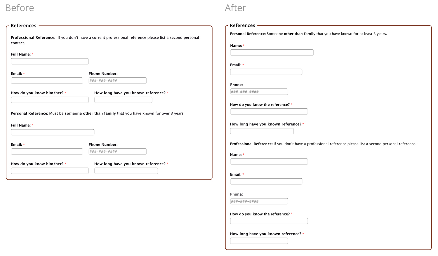
Matching graphical input: Changing to a radio button will ease the process by only requiring a single click.

User flow:
We’ve created an user flow that allows the volunteer to complete the online intake all on SF Ed Fund’s Wordpress site. After submitting the volunteer’s full name and email they are now connected with SF Ed Fund and will receive a confirmation email containing a link to the application in case the user needs to fill out the application at a later time.

Simplified online intake:
Based on the limitations and needs of the San Francisco Education Fund this solution delivers a simpler online intake process that can go live without requiring additional design or engineering staff.
Volunteer receives a confirmation email with a link to the application that now lives and is completed on SF Ed Funds Wordpress site.
The online onboarding process has been reduced to a single application form, the number of form fields has dropped from 76 to 41 questions, and the process can now be completed in one sitting in under an hour.


User reactions round 2:
After conducting a second round or usability testing with the updated experience, users enjoyed the clear and shortened process and had this to say about the updates:
“It’s nice to know up front what I need.”
”I would wait for a confirmation email but I won’t wait for registration email, that’s where id drop off.”
”You’re organized and professional and that’s someone I want to volunteer with.”
SF Ed Fund’s next steps:
Have current volunteers test the new process to best understand improvements.
Work with staff to implement the application integration on to their Wordpress site.
Align with legal team to ensure proposed updates can be made.